The Power of the Right Font
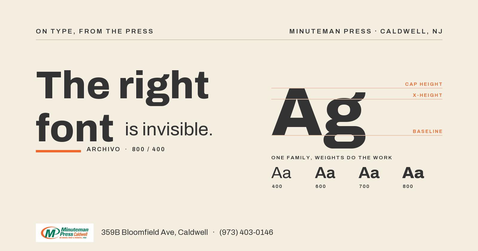
The font is not decoration. The font is the job.
I have watched the wrong font ruin a good design more times than I can count. The art was fine. The color was fine. The font was wrong for where it had to live. Here is what I have learned standing at the press.
1. A sign font is not a book font
A book font is built to be read up close, sitting still, for a long time. A sign font has to hit you from across a parking lot in half a second. Different job. Set a lawn sign in a delicate typeface and nobody driving 30 mph reads it. Pick a font with weight and open letters. The car does not slow down for your typography.
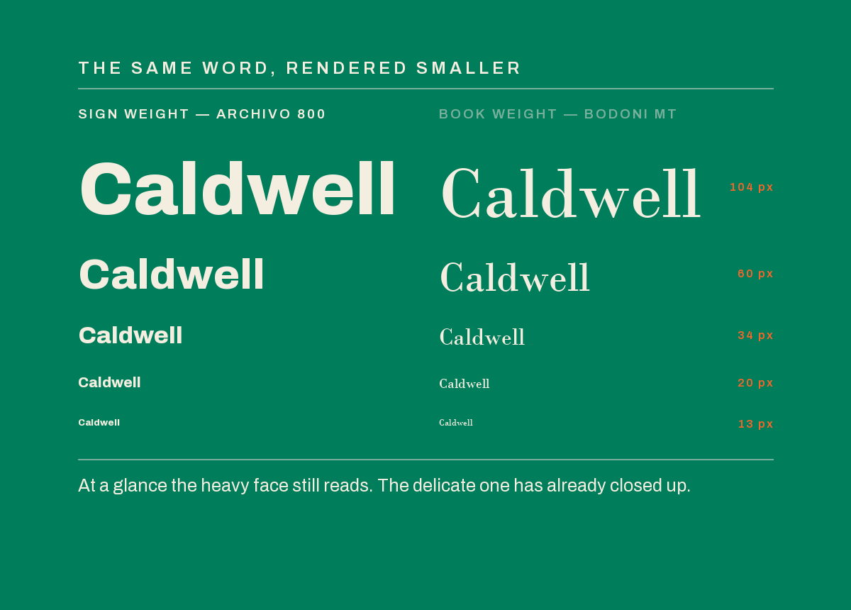
2. Thin strokes break up in print
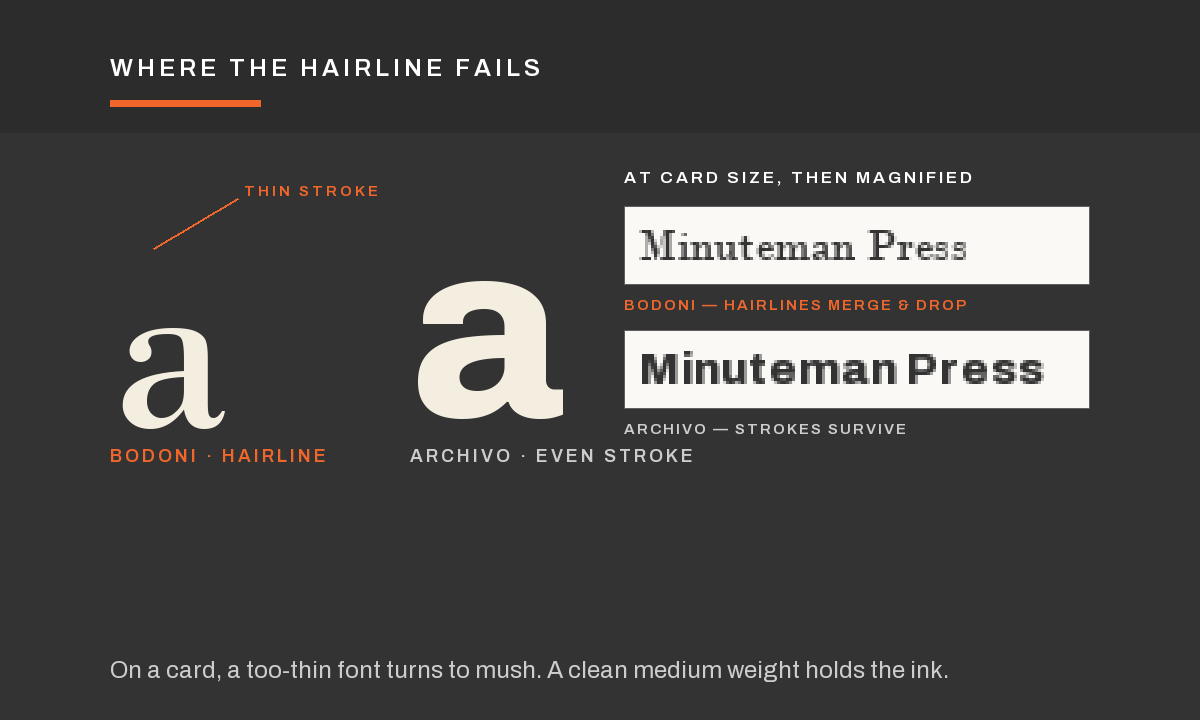
A hairline font looks great on a bright screen. Then it hits paper. The thinnest parts of each letter start to fill in or drop out, especially on uncoated stock or at small sizes. On a business card, a too-thin font turns to mush. I would rather give you a clean medium weight that actually holds ink.
3. Script fonts fall apart small
A script font at a big size on an invitation is beautiful. The same script shrunk to the back of a business card is a smudge. The loops close up. The letters run together. If it has to be small, it has to be simple.
4. X-height decides readability more than size
Two fonts at the same point size can read completely differently. The one with the taller lowercase letters, the x-height, looks bigger and reads easier. That is why one menu feels effortless and another makes people squint at the same size. When someone tells me their menu is hard to read, the fix is often the font, not the size.
5. A jersey number is its own kind of font
Numbers on a team jersey have to read from the stands and survive being pressed onto fabric. Too thin and they crack or vanish at distance. Too fancy and a 3 looks like an 8 from the bleachers. There is a reason athletic fonts look the way they do. They are built for one glance from far away.
6. The right font is invisible. The wrong one is all you see.
When the font fits the job, nobody notices it. They read the thing and get the message. When it is wrong, it is the only thing they notice. That is the whole game. Good type gets out of the way.
If you are not sure which font your job needs, that is exactly what I am here for. Bring me the piece and tell me where it has to live. I will pick a font that survives the press and reads the way it should.
359B Bloomfield Ave, Caldwell. Or call (973) 403-0146.